The Challenge
2019 marked a major milestone in Viettel’s growth journey as the 30-year-old brand announced its new mission: “Pioneering to create a digital society”.
This bold transformation presented two key challenges:
Strategic Brand Transition
Viettel was no longer just a telecommunications provider but was evolving into a comprehensive digital technology group. This required a complete restructuring of its brand strategy and visual identity to accurately represent the position of a regional technology leader.
Shifting Public Perception
Despite its familiarity and strong reputation, Viettel was often perceived as “a kind, trustworthy middle-aged figure — dependable but lacking dynamism.” This image no longer aligned with its vision to become a youthful, inspiring, and innovation-driven technology brand.
The Solution
To meet the demands of a global repositioning, BrandCreativity designed an end-to-end strategic process using proprietary frameworks and insights from international brand experts, covering:
(1) Customer and market research
(2) Brand strategy and architecture development
(3) Visual identity system design and brand guideline creation
1. Redefining Core Values
Based on in-depth research, BrandCreativity and Viettel co-created the new Viettel identity — preserving its legacy while embracing a more contemporary, creative, and inspiring character.
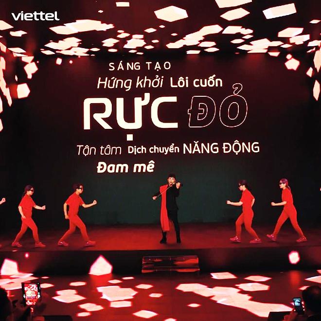
Two existing core values — Caring and Innovative — were retained, with a new value Passionate added to embody the spirit of youth, ambition, and forward energy.
Together, they formed the brand philosophy “Diversity – Harmony that creates distinction”, defined through BrandCreativity’s proprietary “One Word Context” model.
2. Reimagining the Visual Identity
Logo:
The dominant red color symbolizes energy, ambition, and the Vietnamese spirit.
The redesigned “i” character forms a digital conversation frame, representing Viettel’s philosophy of listening, connecting, and respecting people.
The removal of quotation marks and the switch to lowercase letters make the logo feel more open, modern, and human-centered.
Color Palette: Transitioning from military green to vibrant red — a symbol of youth, passion, dynamism, and national pride.

Typography:
Beau Sans Pro was chosen as the primary typeface for its versatility and recognizability, expressing creativity and modernity across all brand touchpoints.
Slogan:
Simplified from “Say it your way” to “Your way” — shorter, sharper, and aligned with Viettel’s digital transformation while retaining its original brand sentiment.