The Challenge
The challenge in this creative phase was not to redefine FPT Software’s identity, but to translate its existing logo and brand essence into a comprehensive, scalable visual language.
The task required balancing between preserving the integrity of the original logo and expanding it into a dynamic system of visual signals that could consistently express the brand across all touchpoints.
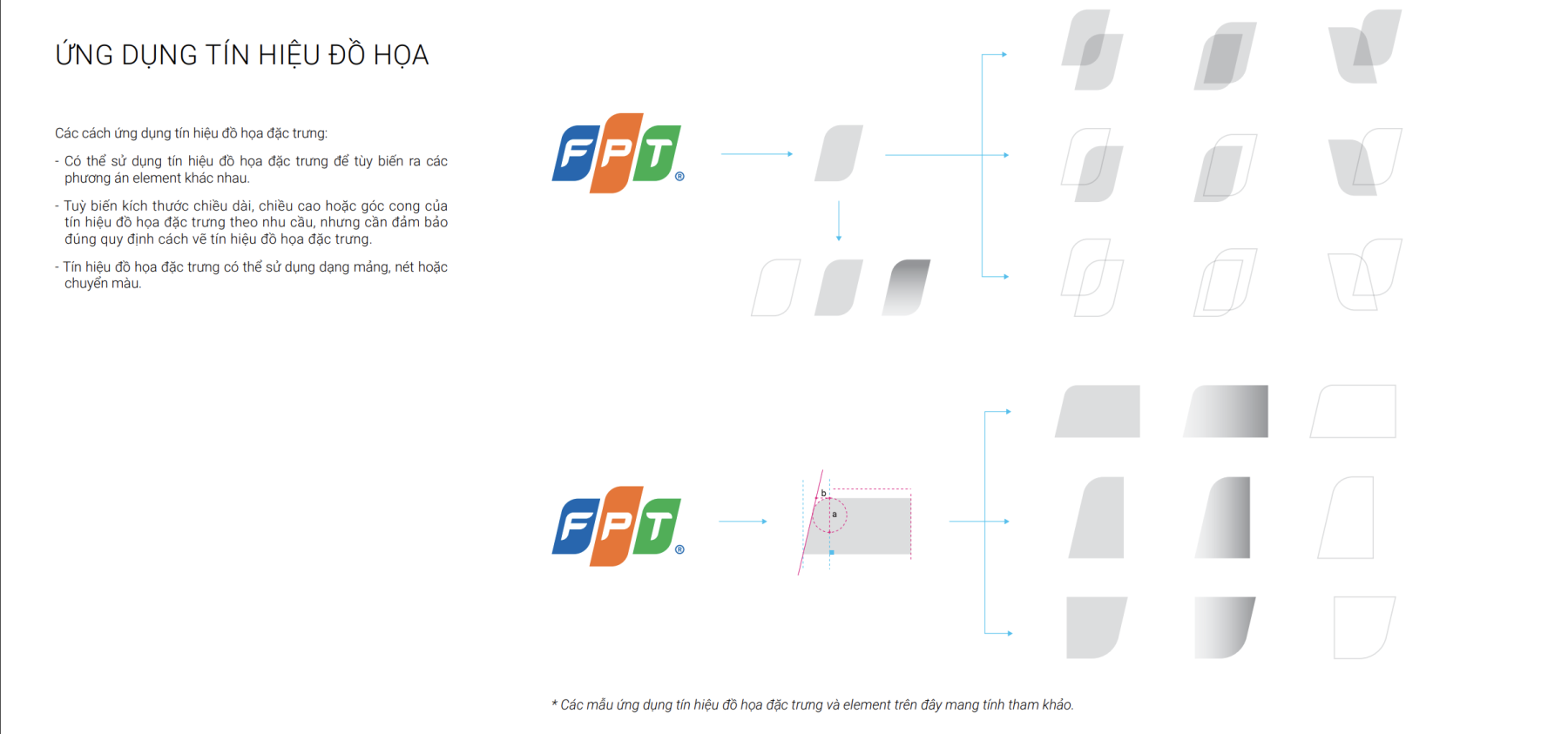
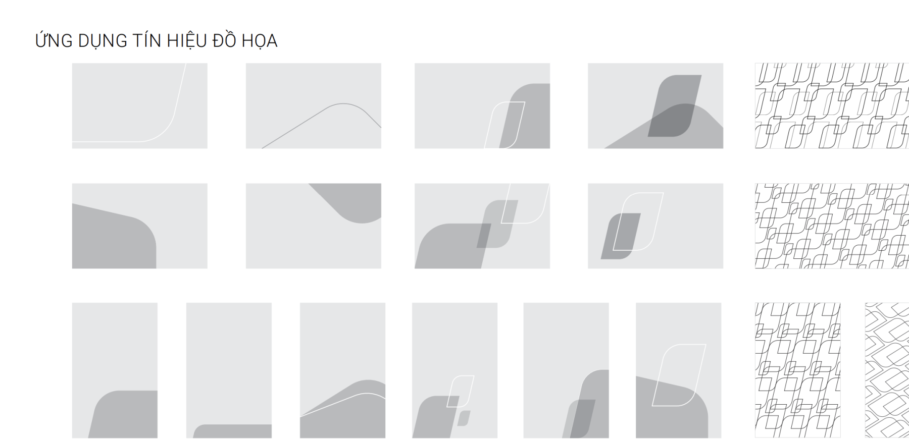
A key difficulty lay in developing the core graphic elements — abstracting from the logo’s geometric and color structure to form distinctive yet cohesive design elements. These patterns had to feel authentically “FPT Software”, visually reflecting its technological DNA and innovative mindset, while still allowing for flexible adaptation in different design formats.
Moreover, the process required ensuring visual harmony and coherence across multiple creative layers — from color palette refinement, typography system, and imagery direction, to the grid and layout structure for applications. The ultimate challenge was to build a visual ecosystem, not just individual designs.
The Solution
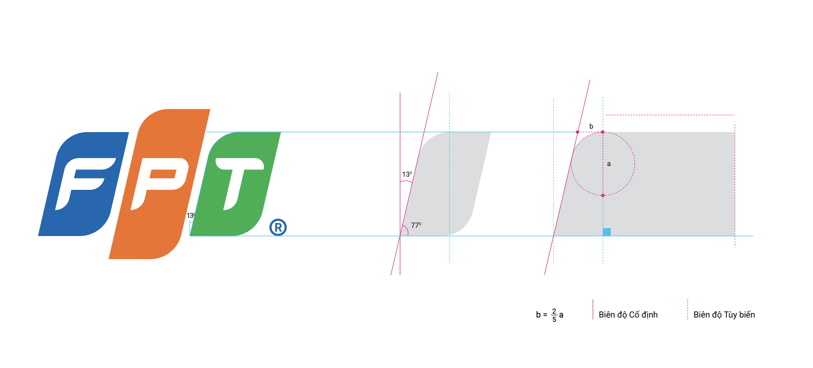
We approached the creative phase by deconstructing and decoding the existing FPT Software logo to extract its key visual principles — shape geometry, proportion, and color rhythm — as the foundation for the new visual system.
From these fundamentals, we developed a base motif library and expanded it into a modular design system that integrates color hierarchy, typography, and layout structure. Each visual component was crafted to reinforce consistency while allowing flexibility across corporate, digital, and event applications.
By systematizing the use of base patterns, grids, and design ratios, the new identity system provides FPT Software with a coherent and expandable visual framework — one that strengthens recognition, enhances clarity, and ensures design scalability for future growth.